There are more than 1 billion websites currently on the web. Even though more than 80% of these websites are inactive, it is still a very competitive and crowded market.
With new websites emerging almost every second, how do you ensure you get noticed in this cluttered virtual space?
In collaboration with one of the top custom software development companies in the UK, we have created a list of four useful tips for designing an eye-catching website that will ensure you meet your visitors’ needs.
- Think about the color combinations
- Use the negative space
- Get the most from multimedia content
- Design for usability
Let’s start!
1. Think about the color combinations
We often associate certain colors with various emotions and meanings. This is something you should keep in mind when designing a website. Unfortunately, things are rarely this simple.
Here are two factors you should consider before you decide on what tones to use in your web design.
- Cultural context
Certain colors have deeply rooted cultural meanings. For example, in Western cultures, red is used to evoke a sense of emergency and danger, while the same color represents luck in Eastern cultures.
Not even black is viewed the same in every part of the world. This color is often associated with death and mourning in the Western world, while it symbolizes wealth and prosperity in Eastern countries.
The color blue, on the other hand, has a positive connotation in almost every culture – from immortality, trust, and authority to peace and calmness.
Before you decide on the color palette you will be using for your web design, think about where your target market is based.
If you are designing a website for a global market, try avoiding colors that have a distinctly negative connotation in certain parts of the world and use the ones that are associated with positive emotions in most cultures.
- Color theory
 [Source: flux-academy]
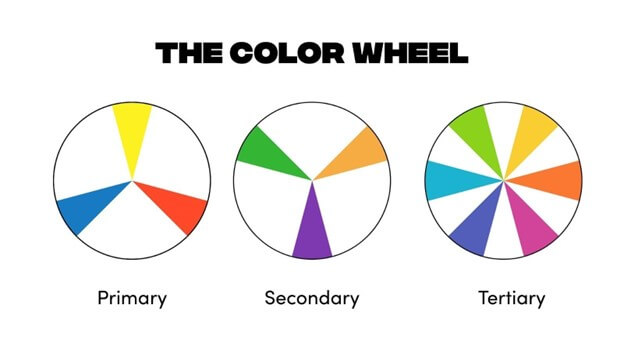
Color theory refers to the basic principles of creating harmonized color combinations. As shown in the image above, we can differentiate between three main color categories – primary, secondary, and tertiary.
To create color harmony, you can use one of the following patterns:
Monochrome is a color scheme made by using different tints, saturations, and shades of one basic color.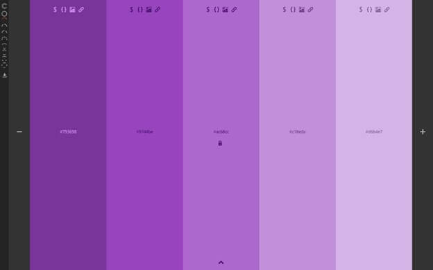 [Source: Webflow]
This color scheme in web design can be very effective in conveying the desired message. Here is one such example: [Source: Onextrapixel]
You can almost feel the melancholy just by looking at these different shades of blue.
The complementary color scheme is based on two colors that are opposite each other on a color wheel. 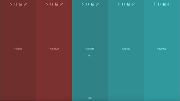 [Source: Webflow]
Complementing colors can help your website look memorable, attract instant attention, and be more readable. Here is an example of such a website: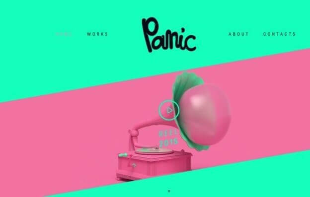 [Source: Bluleadz]
It looks playful and eye-catching and makes every detail pop up.
The analogous color scheme consists of two or three colors that are next to each other on the color wheel. This color scheme is easy-on-the-eye, and it can give your website a soothing ambiance.
One such example is the Dropbox website: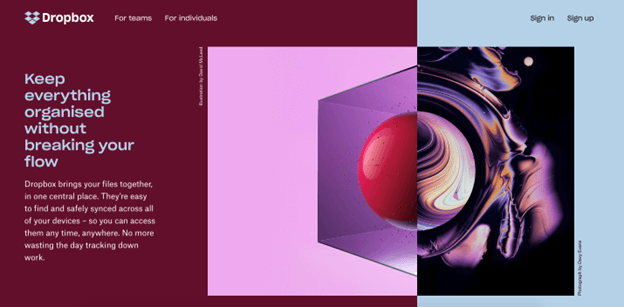 [Source: Bijoumind]
It has that calming effect, almost as if you were watching a beautiful video in slow motion.
In general, you can use colors in web design to create a more memorable brand, highlight important elements on your page, and stir the emotions of your target audience in the desired direction.
2. Use negative space
Taking advantage of negative space can help you create a website that is not only more aesthetically pleasing but also easier to scan and read.
Here are three tips for effectively applying negative space to your website design:
- Use the concept of visual hierarchy
Visual hierarchy is a method of arranging design elements according to their level of importance.
You can apply this concept by using one of the most popular layouts in web design – The Z-layout. [Source: webdesign.tutsplus]
This layout follows our natural eye movement when we scan a website for desired information without actually reading every word on the page.
This pattern is best used for your landing page as it quickly stirs your users from your logo to the call-to-action.
- Use negative space to break up the page
Breaking up the page with negative space is a very important visual component in web design. It aims to help your visitors navigate your pages with ease by offering resting areas between the different sections.
The key principle in using negative space for dividing the page sections is creating symmetric compositions. This principle implies that the gap between micro blocks takes up to one-third of the gap between macroblocks. It should look something like this: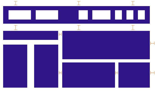 [Source: Speckyboy]
- Split the text for better readability
Reading huge blocks of text that are crammed together can be very tiring for your users. Splitting the text with negative space is an absolute must if you want to keep your visitors engaged on your website and interested in your content.
 [Source: Sitepoint]
The image above clearly indicates how much easier it is to read text on the right that has more negative space inserted.
Most visitors will simply bounce off your website if faced with text that looks like the one in the image on the left side.
3. Get the most from multimedia content
Including multimedia content in your web design is something that today’s users expect to see and interact with.
The two most popular types of multimedia content are videos and images.
Videos
The statistic shows that 72% of people prefer watching videos to learn about a product or service. This only confirms that people don’t like to read huge blocks of text to get the desired information if they don’t have to.
There are many types of videos you can include in your website design, but the four most common ones are:
- Explainer videos are used to provide details about your products or service.
- Tutorial videos demonstrate how to best use your product or service.
- Review videos are short snapshots of the customers’ experience with using your products or service.
- Testimonial videos are longer customers; stories that often emphasize how your product made their life easier – so-called before and after videos.
Images
Images are a great tool for providing additional clarity to the textual content. Three types of images that are most commonly used in web design include:
- Photos – best for accomplishing a more appealing, artsy look to your website.
- 2D graphic – best for attracting visitors’ attention.
- Infographic – best for explaining more complex bits of information.
Besides boosting User Experience (UX), multimedia content is also a great tool for obtaining higher engagement rates and a better position on Search Engine Result Pages (SERPs).
4. Design for usability
Designing a visually appealing website is important, but visuals can only take you so far. To truly answer your users’ needs and create a website that converts and is easy to use, you need to design with usability in mind. Here is how:
- Optimize your website for mobile devices
More than 53% of all web traffic comes from mobile devices. This means you will lose a lot of potential visitors if your website isn’t optimized for mobile devices.
Here is what you can do to ensure your website stays consistent on all devices:
- Use custom CSS
- Opt for responsive themes and plugins
- Improve your website’s loading time
- Design your pop-ups with mobile users in mind
- Make sure your website is easy to navigate
Navigation is a crucial element of your website design as it is the only thing standing between your visitor and the completion of their desired action. To make it easier for your users to move around your pages, try the following:
- Make hypertext stand out from the rest of the text
- Streamline your navigation bar
- Detach sidebars from the rest of the content
- Make sure your navigation is intuitive
- Make your call-to-action button easy to spot
- Create valuable content
If you want to gain your visitors’ trust, you need to create content that offers valuable information. Three steps in creating content that your visitors want to consume include:
- Identifying your target audience
- Putting the content strategy in place
- Creating the actual content
Research shows that content marketing costs 62% less than any other traditional form of marketing while generating 3 times more leads. Even though content marketing takes some time and effort to develop, it is definitely worth the hustle.
Key takeaways
Designing a website that looks appealing is a challenging task. You need to understand colors and their relationships and make the most use of negative space if you want to create a website that is “easy on the eye.”
But cleverly balanced colors are only one part of an attractive web design. You will also need to provide value to your visitors by offering them content they want to consume. You can achieve this by including videos, blog posts, and images in your web design.
Don’t forget to optimize your website for usability so that your visitors can move smoothly from page to page.
We hope our article helped you understand what you need to do to design a website that will stand out from the crowd and provide value for its users.
Tomas McKannie is a digital marketing specialist and a freelance blogger. His work is focusing on new web tech trends and digital voice distribution across different channels.
Website stock image by McLittle Stock/Shutterstock