A company’s logo is more than just an image. Often, it’s the first point of contact of your brand: a symbol, a reminder, and a statement of intent.
Most logos combine typography and graphic elements, but did you know that there are different types of logo to leverage for your brand? From monograms and pictorial marks, to abstract icons, cheerful mascots and heritage-inspired emblems, matching a brand with the right kind of logo is key to ensuring that a company’s visual identity reflects its attributes and values in an authentic and effective way.
Here, we explore four of the most common types of logo and how small businesses can leverage each to make the most of their branding:
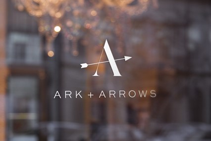
Monogram Letters and Wordmarks
IBM, HBO, BBC, NASA – are you noticing a pattern?
In a saturated market, establishing instant familiarity poses an immense challenge, and abbreviations of longer business names is often a way for organizations to create a more memorable brand.
This works just as well for small businesses: Short, punchy abbreviations stick in the mind far better than longer, complicated phrases – and open up an array of creative options when it comes to designing a logo.
And it’s not just about acronyms, carefully designed initials offer opportunities for distinctive visual identifiers in an array of styles. Think about McDonald’s golden arches: a simple capitalized ‘M’ has become a distinctive and memorable symbol that is instantly recognizable around the world.
 Jewelry brand logo designed by green in blue on 99designs by Vista
Pictorial Marks
This is what probably comes to mind for most people when they think of a logo. A pictorial mark is a symbol or graphic, sometimes called a brand mark, that is instantly recognisable, like Nike’s athletic tick, or the iconic bitten Apple.
A true brand mark is only an image, with no associated text. Because of this, it can be a tricky logo type for new companies or small businesses without strong brand recognition to use in isolation. That being said, nearly all well-known pictorial marks in mainstream culture are evolutions of logos that once included the brand name, so all is not lost if you’re a new company looking to emulate the bigger players.
Creating a visual emblem that acts almost as an icon is a creative tool that smaller businesses can absolutely build into its branding. A hospitality business or cafe for example, can easily translate a pictorial logo or motif across its marketing materials – on menus, cups, even as a repeat pattern design on decor – alongside other visual brand elements.
Of course, combining a wordmark with a pictorial logomark allows consumers to start associating your business name with your logo symbol, and is a good place to start for most small businesses keen to leverage this style. Additionally, because a combination of text and image together is more distinctive, this type of logo is typically easier to trademark than a pictorial mark in isolation.
 Pictorial logo element for tattoo and art gallery, Canavar (meaning monster) designed by ludibes on 99designs by Vista
Mascots
What better way to infuse warmth into a brand than with a friendly face? Mascot logos feature illustrated characters meant to charm and disarm audiences, often through playful personalities.
Iconic mascots include the Energizer Bunny’s perpetual drumming, Geico’s peppy gecko selling insurance with wit, the Kool-Aid Man, KFC’s Colonel, and Mickey Mouse epitomising Disney magic. These characters charm audiences, building affinity by cheerfully personifying corporate values or products through vibrant and engaging design.
These vibrant icons act as welcoming brand emissaries rather than cold corporate cutouts, and this is a creative style that works beautifully for small businesses looking to show off and highlight their brand’s personality.
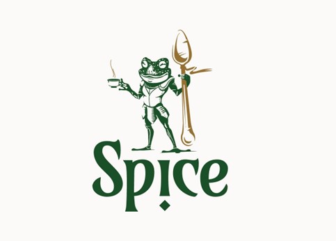 Logo and mascot design for tea brand Spice by Moxie Mason on 99designs by Vista
Emblems
Emblem logos generally consist of text within a shape or icon, calling to mind badges, seals or crests. These legacy-inspired designs are often a go-to style for schools or historical organizations thanks to the classical look and feel they embody. For smaller businesses, they can be a great option for family-run firms or those keen to maintain and highlight the legacy and heritage of their brand story.
However, there are other things to keep in mind. Because traditional emblem logo styles are fairly complex, they don’t always lend themselves to being used across all brand elements: they can be too intricate for small canvases like business cards, and difficult to replicate through some digital and physical mediums, for example, embroidery.
Car brands have traditionally embraced this style of logo, but the industry as a whole has typically modernized and simplified the look of their emblems in recent years to adapt to modern tastes and trends. Other brands who have leaned into the aesthetic but updated their emblems for a more simple, uncomplicated look include the iconic mermaids of the Starbucks emblem logo, or even the famous crest of Harley-Davidson, which of course, needs to look perfect on a patch.
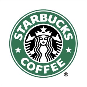
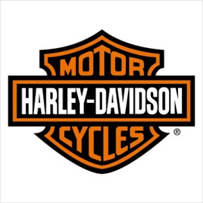 Starbucks and Harley-Davidson have modernized emblem logos
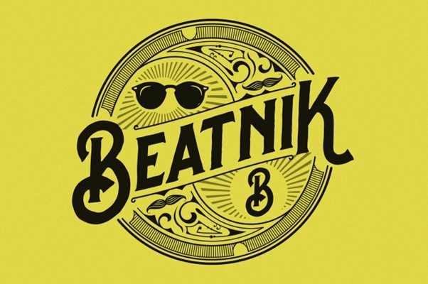 Beatnik emblem logo design by Project 4 on 99designs by Vista
Key Logo Takeaways
There are as many styles of logos as there are types of business: it’s never a case of one size fits all, and there are many things to consider when choosing your brand’s logo style.
Pictorial logos can powerfully convey brand identity through symbolic imagery, but they can be hard to recognise for newer brands, and too narrow if your business model pivots or changes over time. Simple monograms or wordmarks can limit creativity in your branding, and can benefit from some of the more fun, dynamic characteristics of mascot or emblem designs for example.
As mentioned before, a combination mark – that is to say logos combining pictorial and and word or lettermark elements – is by far the most versatile and popular choice for small business brands. Combination logos are versatile in terms of allowing brands to express what makes them unique while allowing for the flexibility to experiment with different styles in a way that creates space for your visual brand to evolve alongside your business as it grows.
Patrick Llewellyn is the CEO of 99designs.
Graphic design stock image by REDPIXEL.PL/Shutterstock